Some Cool Things We’ve Seen in June.
2 minute read…
This week I took the time to document some cool brand moments, activations or design work I’d seen throughout June. Keep scrolling to hear about a great advert, a clever activation and a pretty cool music video.
Yonder Bank Adverts:
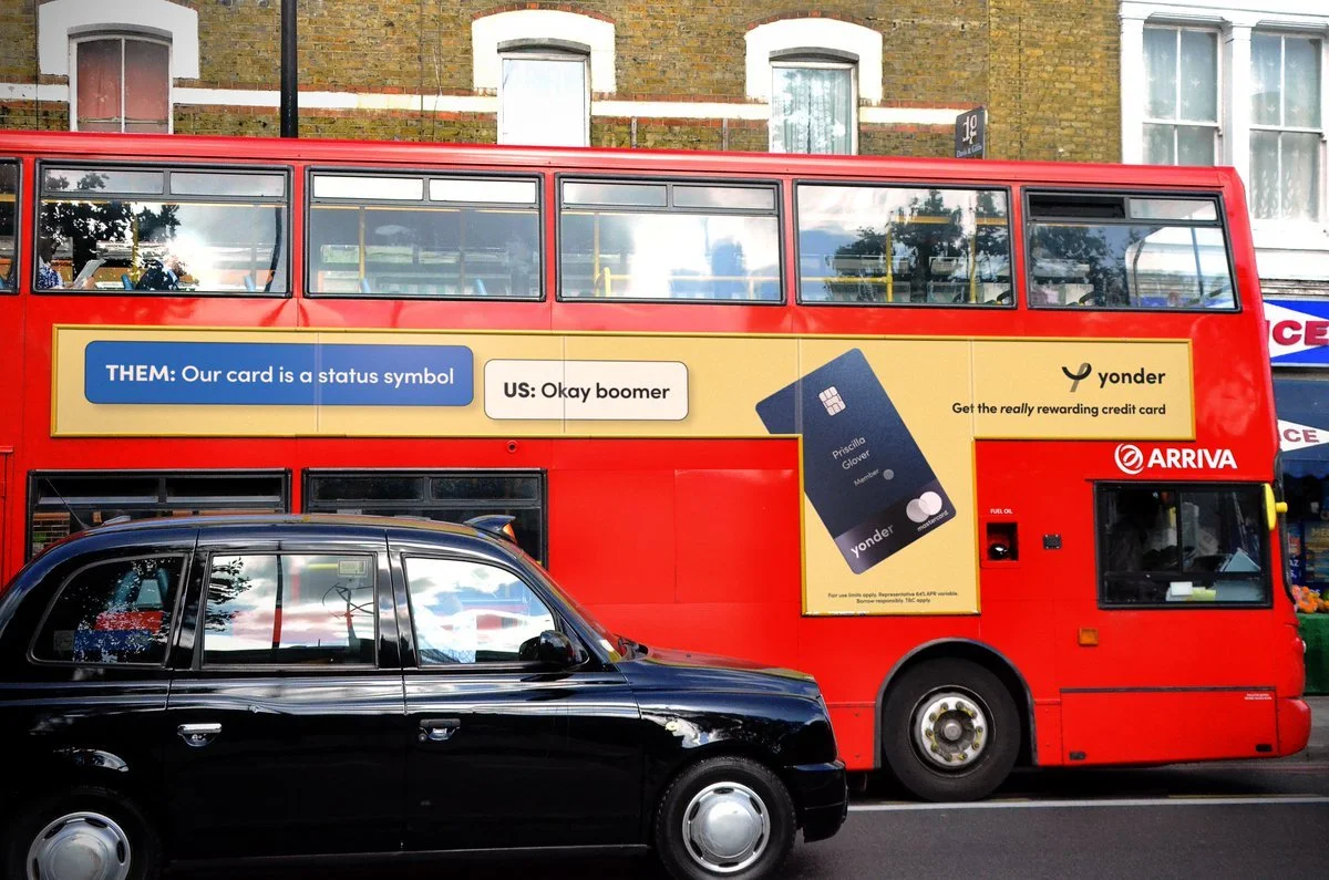
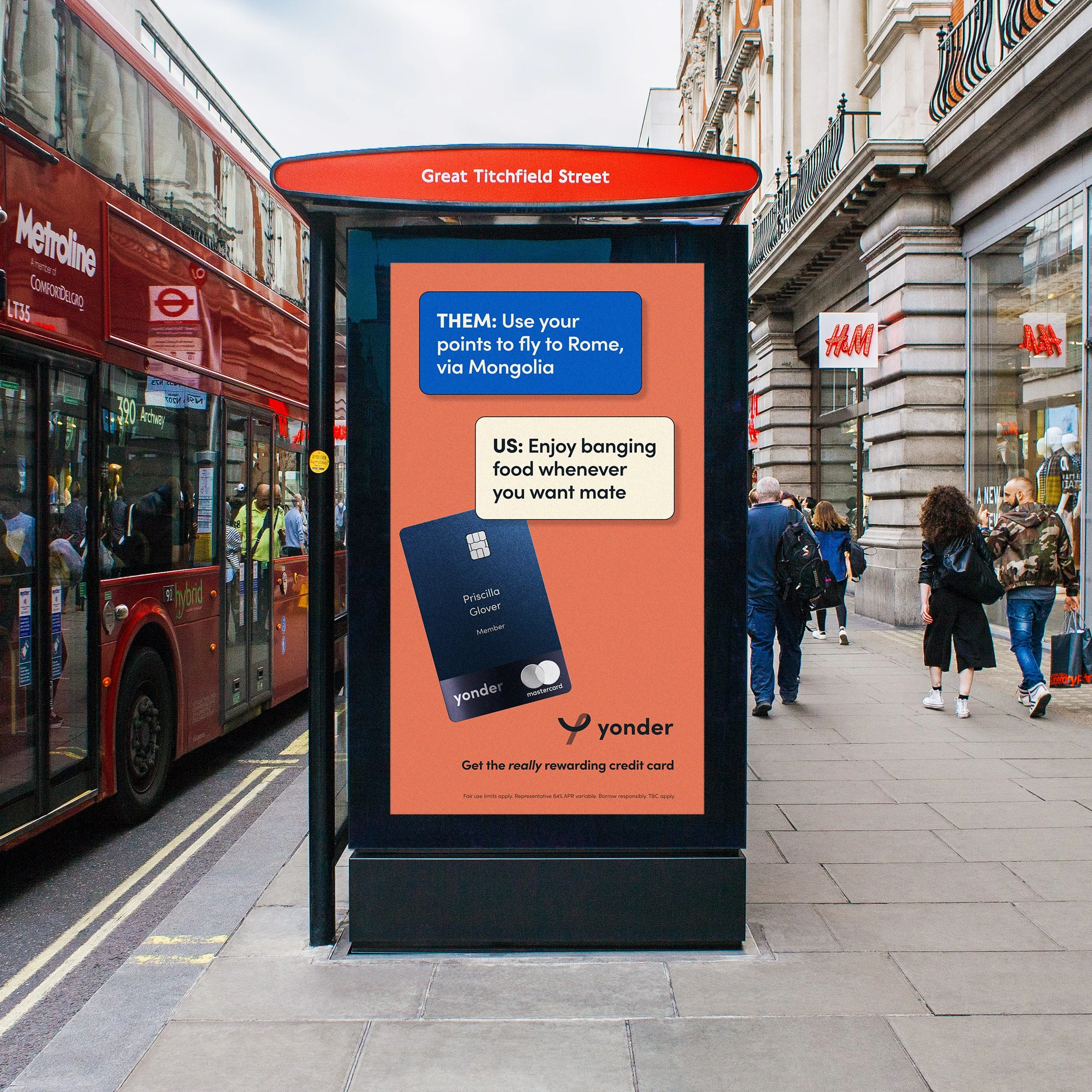
I saw the latest Yonder bank campaign while on a lunchtime stroll in London this week and I really loved it!
Described as the ‘The epic credit card for foodies’, Yonder is one of a number of disruptive brands making noise in the banking world. This campaign is all about celebrating the relatability of Yonder’s rewards schemes. Playing on the fact that credit cards conventionally deliver un-relatable or unachievable points schemes and rewards programmes, Yonder is a new wave of credit card.
I particularly loved the bus campaign that reads:
“Them: Our card us a status symbol”
“Us: Okay boomer”.
This plays on the idea that historically, certain credit cards have been perceived as a status symbol, but that this idea does not inspire or excite a new generation. The next gen want relatability, authenticity - they’d rather quickly collect points to dine in their favourite restaurant, than have the ‘right’ brand of credit card sat in their wallet (if they even carry one)! I enjoyed the tongue-in-cheek language and the clear understanding of what resonates with their audience - great work, Yonder.
Huel Vending Machines
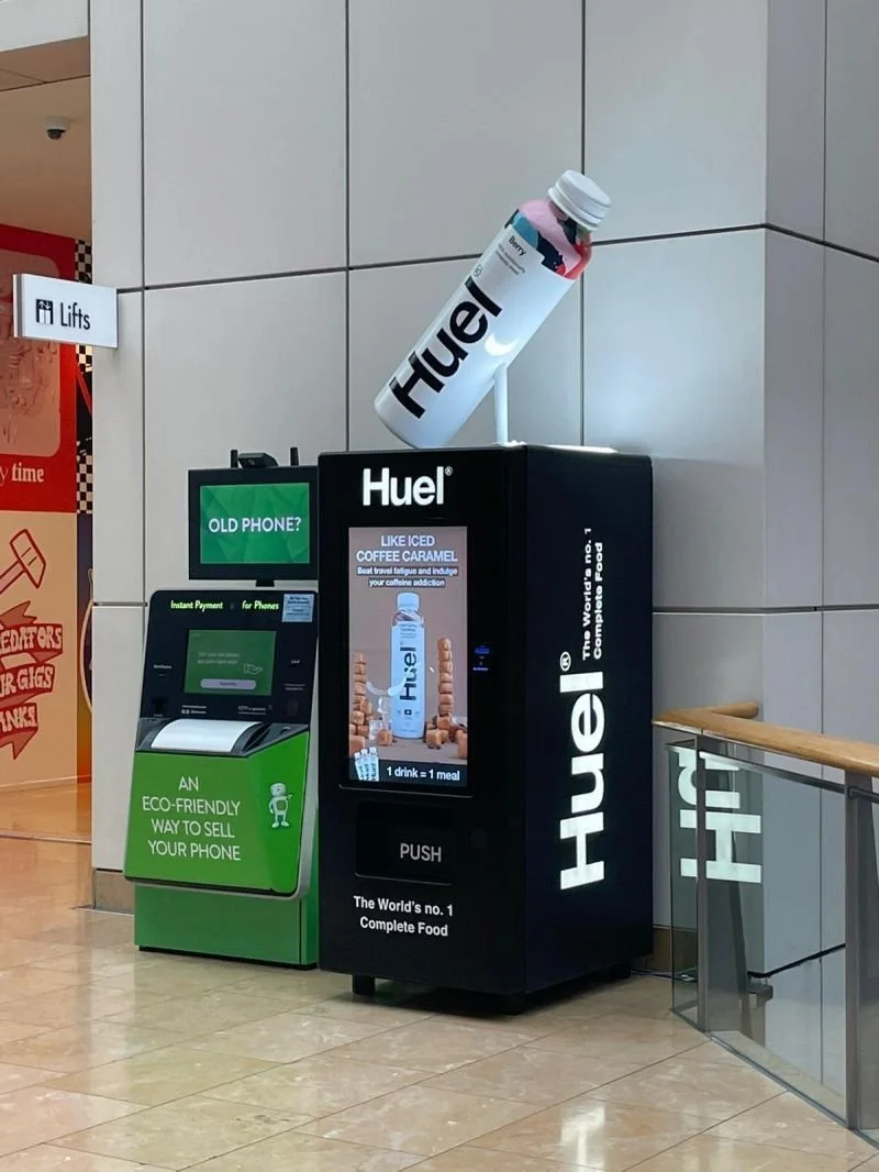
I love this. I saw these in-person in Grand Central station, Birmingham, and it felt like a genius brand decision. I am already a fan of the Huel shakes, i’ll grab one every now and again when I am on the road. Huel create nutritious, meal-replacement drinks, while vending machines traditionally dispense unhealthy snacks and drinks. These two worlds colliding provides commuters and travellers with a nutritious option, delivered in a more convenient way than ever before.
Seeing these vending machines reiterated the importance of defying conventions. Brands have to understand where their consumers really are, and ask themselves how they can get in front of them. Or, what conventions can we break? Where can our brand show up in unexpected ways? It is more important than ever to do things a little differently.
Little Simz, Gorilla video
Little Simz released her video for Gorilla this week. If you haven’t heard it, Gorilla is my favourite track from her latest studio album ‘No Thank You’, released back in December.
The video is a masterpiece and well worth a watch. It aligns with Little Simz’ cool, authentic brand image and it was directed by the legendary Dave Meyers, so the art direction manages to deliver a touch of nostalgia alongside some future-proof creative ideas.
Anyway, enjoy:
As a studio we are always talking about what brands are up to and what’s inspiring us, I’d love to know what has got you talking in June - DM us on Instagram or LinkedIn.
Or, if your brand needs to make some noise, let us help, drop us a note at hello@unfound.studio.


