
PEARSON + PARTNERS
Putting human partnership back into private equity.
Sectors: B2B, Private Equity
Services:
-
Competitor analysis, proposition, values, narrative & brand architecture.
-
Visual identity; logo, typeface, graphic style & more. Verbal identity; tone of voice, brand tags.
-
Copywriting, photography, art direction, web design, brand collateral.
Understanding The Brief
With a successful business built on partnerships and deep experience of connecting people to private equity, Pearson + Partners were yet to carve out a brand they could truly own.
We channelled the human consideration and genuine collaborative nature of the Pearson + Partners, and its charismatic Founder, to build a system that could consistently communicate people-first private equity partnerships.
Finding The Unfound
Our research revealed, unlike many of the heritage or algorithmic-based PE consultancies that saturate the sector, Pearson + Partners could capitalise on an untapped USP. Operating in their market as a collective who put the ambition & values of people at the heart of what they do, we brought the brand to life around the idea of ‘considered connections’.
On a mission to make the sector more human through the P+P offering, we shifted from the facelessness of business 2 business, towards a ‘business to human’ connection — helping entrepreneurs source capital from funders that are right for them and their proposition.


Under The Surface
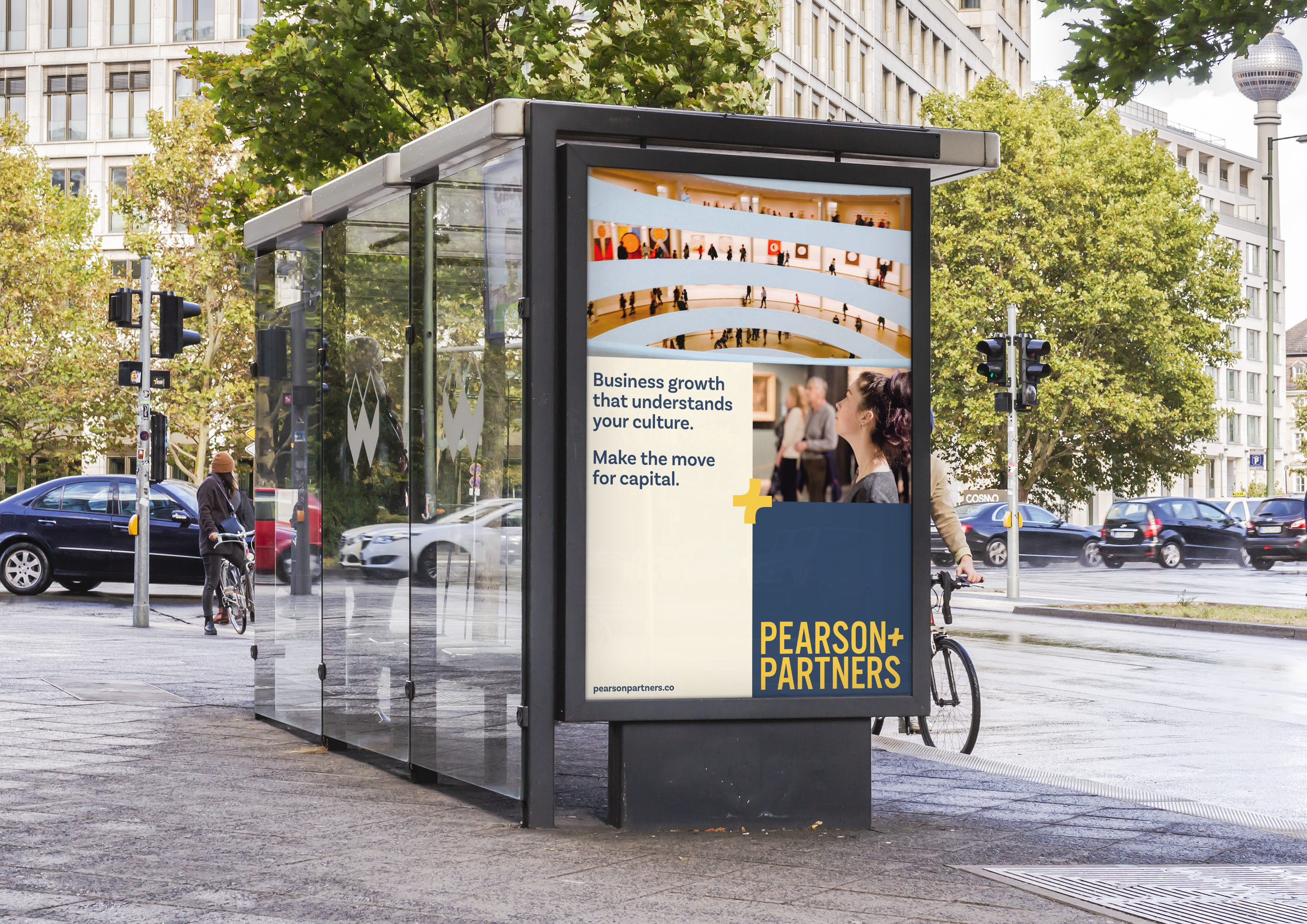
The plus icon, taken from the point where the two ‘P’s meet in the logo, formed the basis of a graphic system punctuated by symbols. The reconfiguration of the plus icon becomes a tool to communicate the benefits of working with Pearson + Partners, a visual prompt for connection, collaboration, growth and direction.
Bringing the brand to life through photography, we said no to insipid, industry-standard corporate headshots. Bringing in an undeniable human presence we included all the unique pieces that make people who they are, from the way they set up their workspaces, to the books they’re inspired by.


Unearthing Value
Unfound produced a complete brand identity and toolkit, as well as a functional website. Bringing brand to Person+Partners enabled a unified way of presenting services, capturing its unique offering, whilst allowing the founder to clearly see the potential for future growth.
“It was with insight, tenacity and flair that Tebo, Jay and the team at Unfound created a new brand and positioning for Pearson + Partners, which enables us to present and communicate who we are in a credible, professional and engaging way. It also enables us as a small business to punch above our weight with large funds and companies. Finally, the brand has been enthusiastically received by our Partners and it will help us to continue to grow the partnership.”
Jonathan Pearson
Unfound Studio Samples


If you are at a turning point, drop us an email.
hello@unfound.studio