Erewhon: Where Design is the Price of Entry
3 minute read…
I was in Los Angeles recently, soaking up the sunshine and the Californian culture - naturally, I made a pilgrimage to the mecca of supermarkets: Erewhon. I went in for curiosity’s sake and came out questioning my loyalty to Sainsbury’s. There’s no going back, really.
Erewhon isn’t just a grocery store, it’s a case study in modern consumer culture - premium products, celebrity smoothies, and an environment where everything is elevated. This is the place famous for its $25 smoothie specials (the Hailey Bieber edition was on when we visited) and where wellness isn’t an aisle, it’s the entire brand.

Branding as a Baseline
As a branding agency, we’re always championing thoughtful design. But at Erewhon, we were reminded that in the premium space, good design isn’t a nice-to-have, it’s table-stakes. Every single brand, from functional drinks to dried mango, is meticulously designed. You don’t see some good design here, you see great design, everywhere.
I was reminded that in the middle of the market, a sharp identity can set you apart. But at the top? It’s the price of entry. Without design that speaks, lives, and breathes your values, executed to tee, you won’t even make it onto the shelf - let alone into someone’s basket.
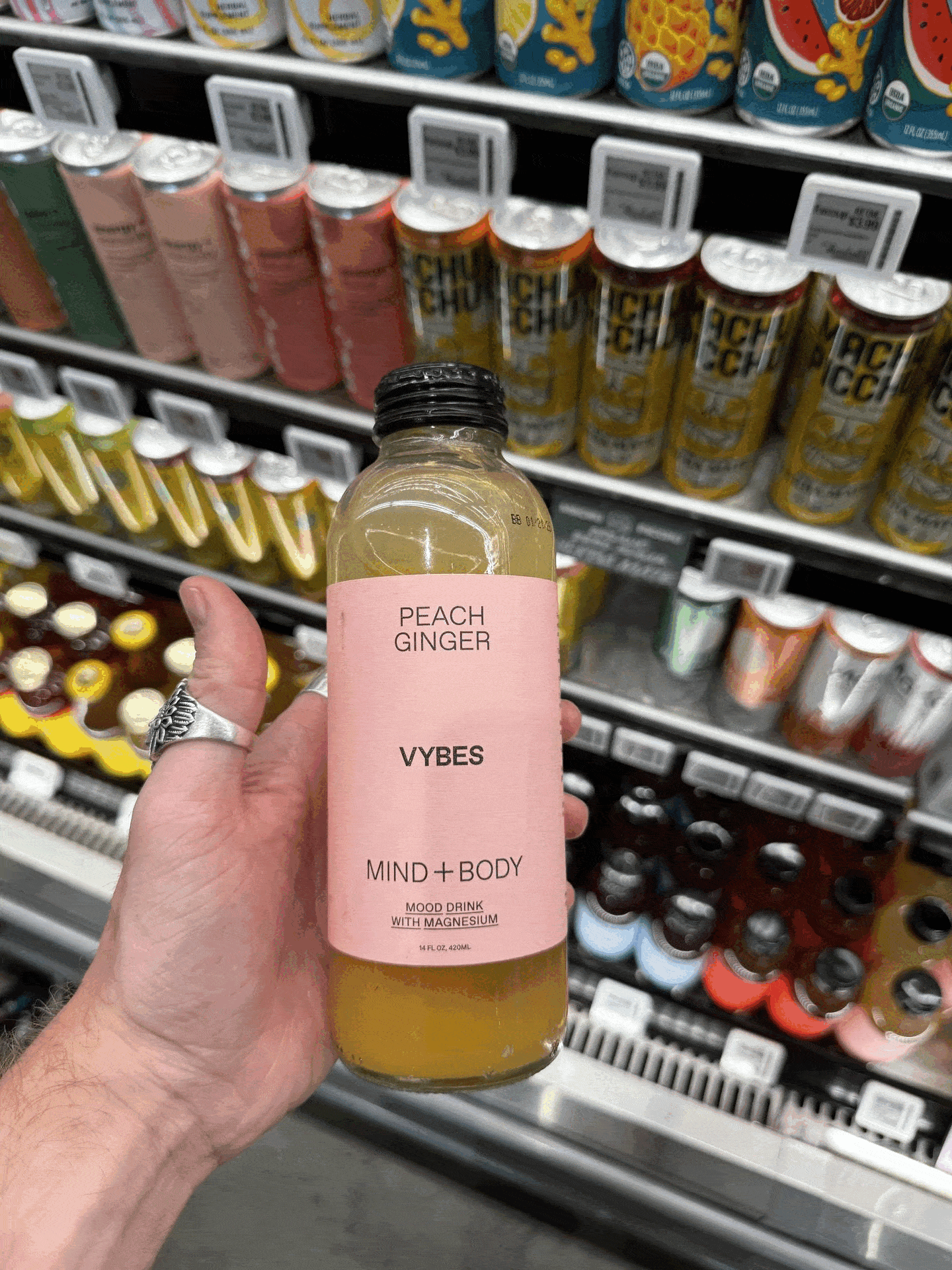
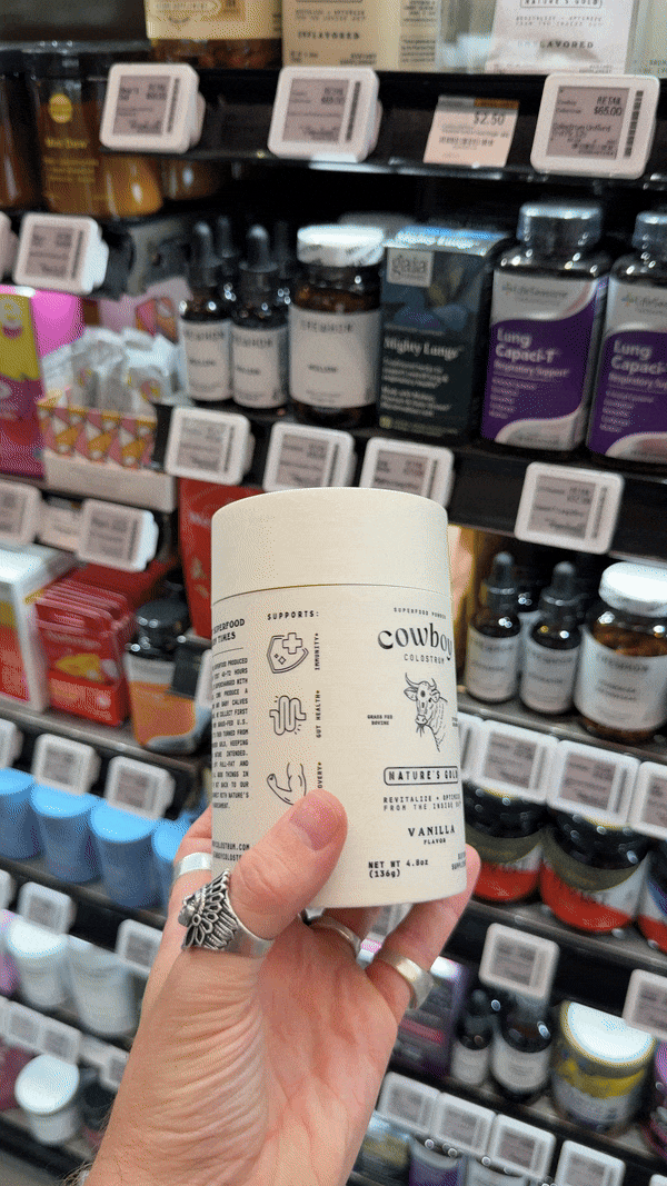
Merchandising That Multiplies Impact
What Erewhon does exceptionally well - beyond curating cool brands - is presenting them. The visual merchandising is next level. The vegetable aisle is stacked like a gallery installation. Shelves throughout the store are meticulously faced, creating a rhythm of colour, shape, and story that makes every product pop. The great design I mentioned is amplified tenfold by Erewhon’s own focus on presentation.


Supplements as Strategy
I spent some time in the supplements aisle - a section I was naturally drawn to given Unfound’s experience in the space. But this wasn’t your typical wall of vitamin gummies and cold remedies. This was a beautifully curated corridor of modern wellness. Premium powders, microdosed sprays, gut health boosters - all perfectly packaged. It felt like a page from one of our competitor analysis deck (particularly with the end aisle display by Seed).
More than anything, it showed how Erewhon’s belief - “…that nutrition is the key to a radiant lifestyle” - comes to life through both product offering and presentation. They’ve built a space that makes premium health feel aspirational and accessible, without saying a word.

The Takeaway?
If you care about brand, Erewhon is a playground. It’s a masterclass in how design shows up, speaks loud, and sells without shouting. What surprised (and excited) me most was just how essential great branding is at the top end of the market - not a differentiator, but a given. It left me both energised and reassured: when it comes to premium, design really is everything.
Want your product to feel more premium, stand out in your category - or just chat brand over smoothies? Let’s talk.
hello@unfound.studio | Let’s chat
